
Nintendo
A speculative rebrand focused on player agency, imagination, and the evolving identity of Nintendo
For my senior capstone project, I chose to develop a speculative rebrand for Nintendo. The assignment allowed each student to select a company and determine the scope of the work, so I chose a globally recognized brand with substantial cultural and visual equity. I wanted to explore whether Nintendo could express its history, playfulness, and spirit of innovation through a more distilled identity for the Switch era.
At the time, Nintendo was still using the rounded “racetrack” wordmark introduced in 1975. Although the company was already highly recognizable, I felt the logo lacked the boldness and refinement of the simplified marks used by other major console brands. I returned to Nintendo’s earlier “NG” mark from 1965 and explored how its connected forms could be modernized into a single symbol that represented Nintendo without needing to spell out the name.
The new mark became the starting point for a larger identity system. I developed the tagline “The Game Is in Your Hands” from the translation of Nintendo as “Leave Luck to Heaven,” connecting the company’s history of playing cards and a game of luck, to the physical experience of the Switch. The tagline placed the player at the center of the brand. Games are not only something Nintendo creates, but worlds that players enter, shape, and carry with them.
I extended that idea into a motion and sound treatment for the logo. The N and G forms would pop into frame and snap together using the familiar sound of the Joy-Con controllers attaching to the Switch. The sequence followed a simple rhythm: “pop-pop, SNAP.” The mark then resolved into “The Game Is in Your Hands,” connecting Nintendo’s visual identity to a recognizable action from the product itself.




Building a parent-brand system
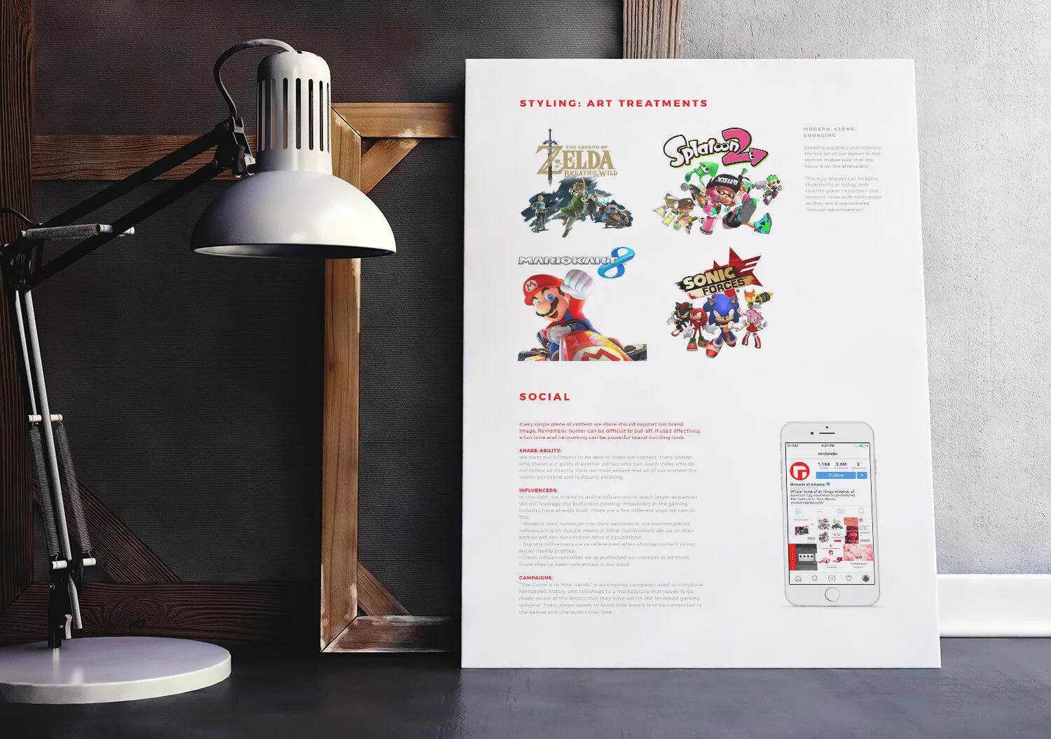
The project developed beyond a logo redesign into a proposed brand standards system for presenting Nintendo and its many games as part of a recognizable family. I created guidance for the logo family, color palette, typography, icons, imagery, key art, textures, social content, advertising, and website applications.
The system used Nintendo red as a primary color and introduced Switch blue as a contemporary reference to the platform. I also established consistent art treatments for game characters and promotional imagery, giving Nintendo a way to present different properties with a shared visual language while allowing each game to retain its own identity.
The social campaign centered on “The Game Is in Your Hands.” These applications were intended to familiarize audiences with the refreshed identity while reinforcing a particular view of Nintendo’s customers: players are imaginative, engaged, and central to the experience. The campaign, advertising mockups, and website examples showed how the proposed system could move across different formats while preserving the same parent-brand voice.
I presented the direction first as a class pitch, then developed the concept into a brand standards guide containing the proposed identity system and application examples. The final guide included my own writing, design, and art direction, with game key art and stock imagery used as supporting material.
Reflection
Looking back on the project after several more years of professional design experience, I can see places where the system could have been developed further. I would likely push the applications, motion language, and brand rationale more deeply today.
I still value the project as an early example of my taste, ambition, and willingness to take on a difficult identity problem. Rather than redesigning a small or unfamiliar company, I chose a brand whose history was already deeply embedded in gaming culture. The project gave me an opportunity to build more than a logo, connect identity to product behavior, and develop a point of view about how Nintendo could present itself to players entering its next chapter.
It remains an example of my early design work that still reflects the qualities I value most: taste, finesse, curiosity, and the courage to question an established system.